The below information talks through each chart or graph within this section.
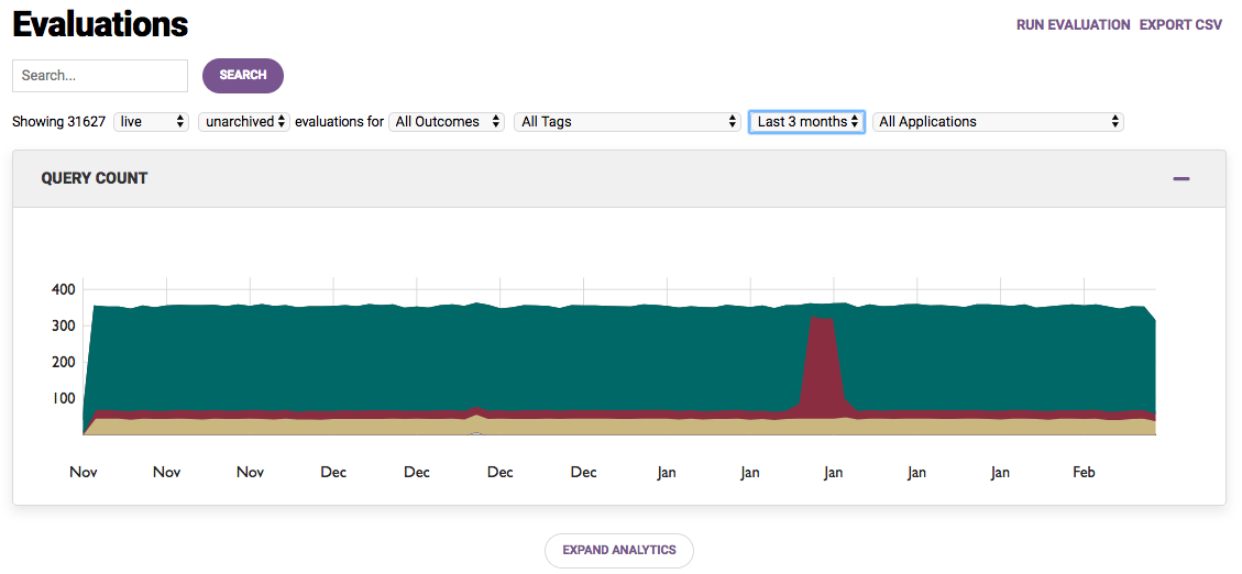
Query Count Graph
The Query Count graph displays the number of evaluations ran based on the dropdown parameters, (see the article Search and Dropdown Options for more information on how these can be used).
The Vertical axis shows: number of evaluations
The Horizontal axis shows: time

Data populates on this graph if there is more than 1 day of evaluation data that falls within the filter criteria.
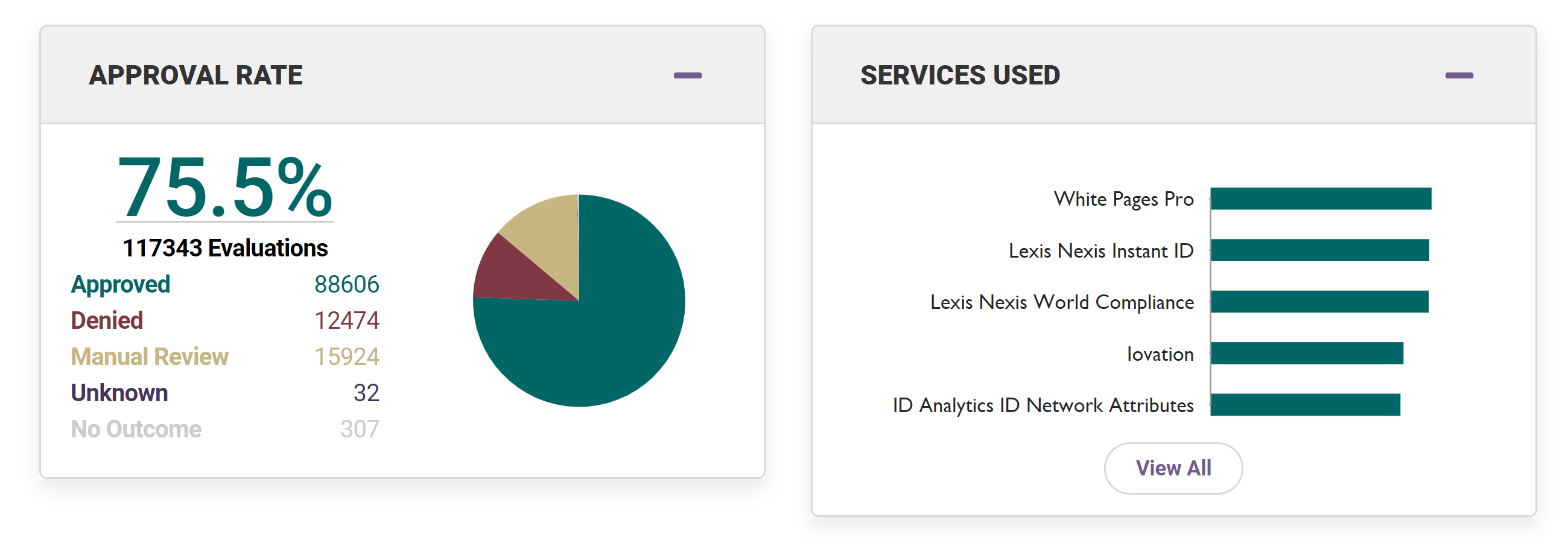
Approval Rate Chart
This chart shows the outcome of the evaluations ran by count and percentage.
This information will change depending on the search or filter that has been applied.
Hover your mouse over the pie chart to view percentages.
Services Used Chart
This chart shows the type of data sources used within the evaluations by count and percentage.
Click on "View All" to see the full list of data sources used within the evaluations. This information will change depending on the search or filter that have been applied.
Hover your mouse over the chart to view percentages.
The Approval Rate Chart can be seen on the left below, and Services Used Chart on the right:

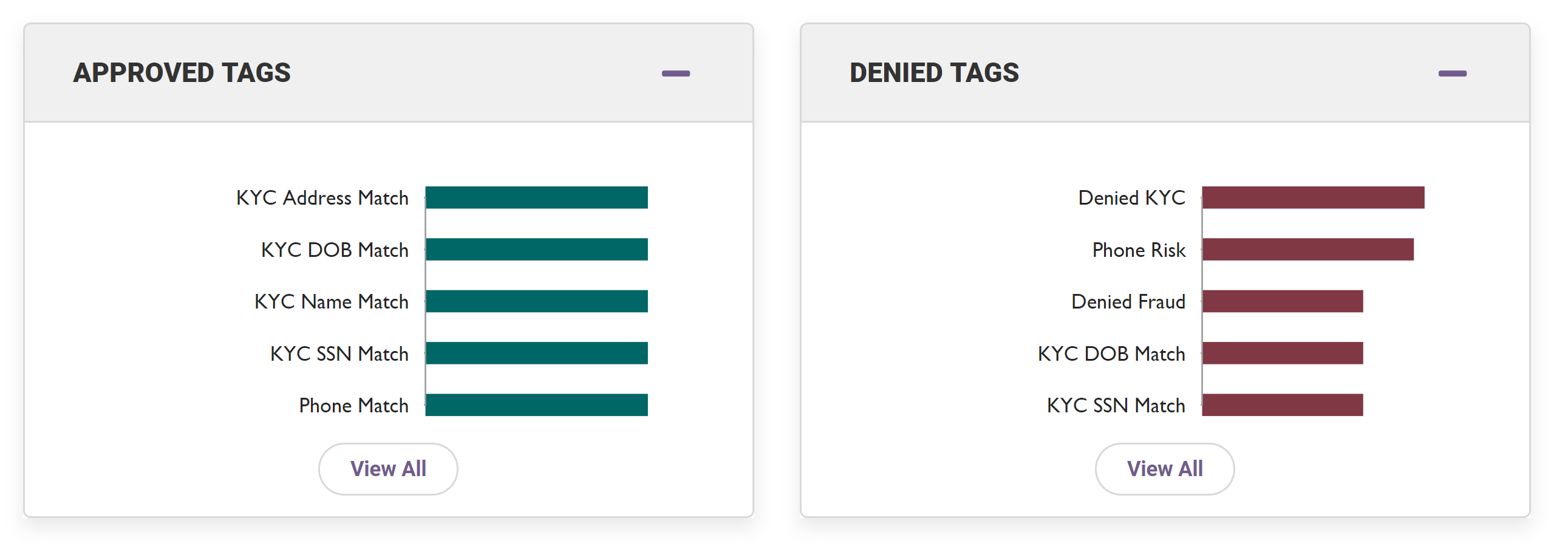
Approval Tags Chart and Denied Tags Chart
At the end of the expanded analytics view are two charts that display the Tags that were used in decisioning approved and denied evaluations. The Tags are sorted by frequency of use across the applications.
- The Approved Tags chart on the left shows the Tags used in the approval of evaluations by count and percentage
- The Denied Tags chart on the right shows the Tags used in the denial of evaluations by count and percentage
Click on "View All" to see the full list of Tags used within the evaluations.
This information will change depending on the search or filter that have been applied.
Hover your mouse over the chart to view percentages.
 Beneath the analytics section, you will see all individual evaluations and their results that relate to the analytics:

Comments
0 comments
Article is closed for comments.